MEZCAL SERAFICO


Project
CLIENT SUMMARY
Seráfico is ultra small-batch artisanal mezcal produced from different wild and semi-cultivated species of agave using ancestral production techniques. The client wanted us to design a unique brand identity that would highlight Seráfico’s authenticity and craftsmanship while being based on an engaging creative theme that would allow for compelling storytelling and consumer engagement.
CHALLENGE
From different craft spirits available today, mezcals are probably the most unique. From manual harvesting of agave plants growing in remote, almost unreachable mountainous areas, to slow-baking them in underground pits and to juicing, fermenting and distilling, mezcal production relies exclusively on manual labor and ancient tools. Not only mezcal is a true hand crafted spirit, it is also one of the most ancient distilled spirits known to humanity.
Despite its fascinating history as well as unique ingredients and production techniques, the US consumers know little of artisanal mezcal, with most of them forming their – rather unfavorable – opinions based on certain inexpensive commercially produced low-quality fiery mezcals and quite inaccurate myths about “mezcal worm”.
In designing brand identity for Seráfico, the challenge was to create an approach to packaging that would showcase product’s craftsmanship and artisanal characteristics, help the brand tap into consumers’ desire to experiment with unusual original spirit flavors while presenting a fascinating brand story that would engage buyers on emotional and intellectual levels.
SOLUTION
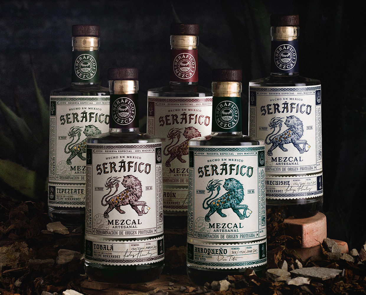
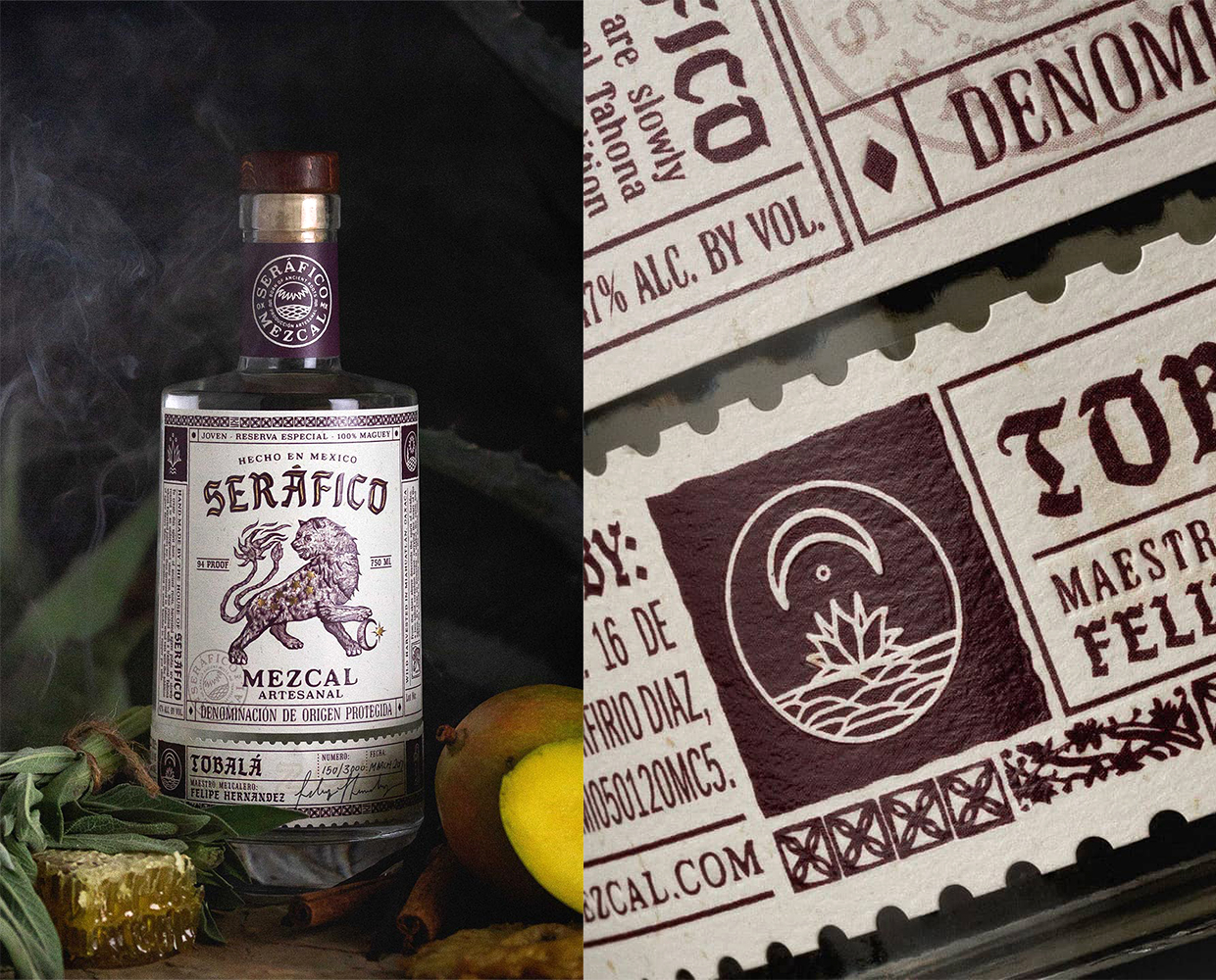
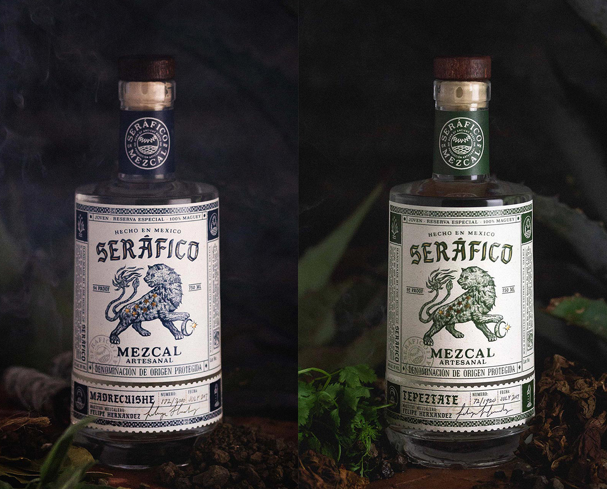
Fascinated with mysterious metamorphosis of caustic and tough raw agave hearts (piñas) into flavorful liquor bursting with flavors and accentuated by smoky aromas, we decided to base Seráfico’s brand theme on an ancient art of alchemy that was centered around mystic transformation of elements. As a result, Seráfico’s illustrative branding is based on a popular alchemical symbol of the Green Lion devouring the Sun; a fitting metaphor for transformation of a green, liquid sulfate called “vitriol” purifies a substance, leaving behind the pure gold. The alchemy’s theme is carried over the entire presentation down to artful alchemical icons symbolizing different steps of mescal’s production process.
The packaging is completed with wrap-around neck labels featuring information about different agave species used in production as well as tasting notes. The result is impactful original branding that fascinates imagination of consumers while presenting them with compelling knowledge about the product and its unique flavors.